Wheatland County shakes things up with a rebrand

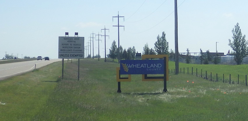
Regular travellers on the Albertan stretch on the Trans-Canada Highway may notice something different along their journey. Wheatland County has undergone a rebrand. The county just east of Calgary is hoping the rebrand will better reflect the area, foster community pride, and encourage more investment.
“It’s about creating a corporate identity that speaks to history and preserves our heritage as a strong agricultural economy, but also creates a corporate that’s attractive at the same time,” said Matthew Boscariol, Wheatland County’s deputy CAO.
Wheatland’s efforts are part of a growing rebranding trend among Canadian municipalities. As communities change, local governments are trying to tap into shifting attitudes and sentiments to keep up with the times.
Earlier this year, New Westminster, BC announced it would be dropping its moniker as the “Royal City.” As part of that rebrand, the city is also updating its logo and working with the community to develop a new brand. “I think we need to recognize the central branding for the city, which has to represent the entire city, shouldn’t probably be focused on one single aspect of the city’s history,” New Westminster Mayor Jonathan Coté told the CBC.
Elsewhere in BC, Prince Rupert also launched a rebranded logo and municipal crest this year. The rebrand is the first update to the city’s symbols in more than a century. The municipality worked with local First Nations artists to incorporate Indigenous themes into the new design.
Wheatland Rebrands
Wheatland’s old crest and logo was much busier than the new design. The county wanted a look with a cleaner finish that could attract business while staying true to the county’s identity. So, county staff thought it’s time for a new logo. “As a county, we want to create an environment that’s attractive for investment. That means improving our processes and looking the part,” said Boscariol.
Municipal logos and crests might not sound that important or relevant to the average person, but they can tell us a lot about a community. They are often also a municipality’s first impression. “It’s the look that people see when they drive into this municipality,” Boscariol said. The new county logo is a different take on Wheatland’s identity as a rural community. It features the county name along with an ear of wheat to the left. Instead of retiring the old design completely, it will be repurposed as the corporation’s corporate seal.
According to Boscariol, the rebrand has already started to produce some results for the community. “We’re seeing that uptake over the last 12 months in terms of development,” he said.
New signs and logos will be brought in gradually as the old ones need to be replaced. The initial priority was getting the new logo on display where the greatest number of people would see it. Signage on the Trans-Canada Highway and other roadways, as well as municipal buildings, are being replaced with the new design.
What also makes the new design different is the way it was created. Instead of hiring expensive consultants and designers, Wheatland went about doing the whole redesign in-house. For the county, making a new logo in-house was about making something the team can have ownership over and feel a strong connection to.
“We really wanted to engage [with staff] so they could take ownership of their new corporate identity,” said Boscariol. That meant including county’s 140 staff in the design process.
Wheatland did an extensive survey to find out what staff liked about the old logos and what they’d like to see changed. The design team then took all that feedback and started putting together some mock-ups. Working off of staff feedback, the team narrowed the design down until they finally settled on the new logo. “We wanted our staff and council to be proud and wear the badge proudly, and I believe we’ve achieved that,” Boscariol said.
Designing the whole rebrand in-house also meant a lot of cost savings. Instead of hiring costly outside consultants and designers, Wheatland utilized their own team’s time and skills to design and implement the project. “It worked wonderfully,” Boscariol said. “Staff were fully engaged, council was fully engaged throughout the entire process, and I think that’s the benefit of the project as a whole. The staff were able to make it theirs.” MW
✯ Municipal World Insider and Executive Members: You might also be interested in David Gingras’ article: Gimmicks and rubber ducks: Personal branding tools for municipal politicians.
Ibrahim Daair is a Staff Writer and Copyeditor at Municipal World.
Related resource materials:


